


October 14th, 2013


Since this one's a bit weird visually, I thought it'd be neat to do another set of process shots for the vote incentive this time. c: Vote to see it!
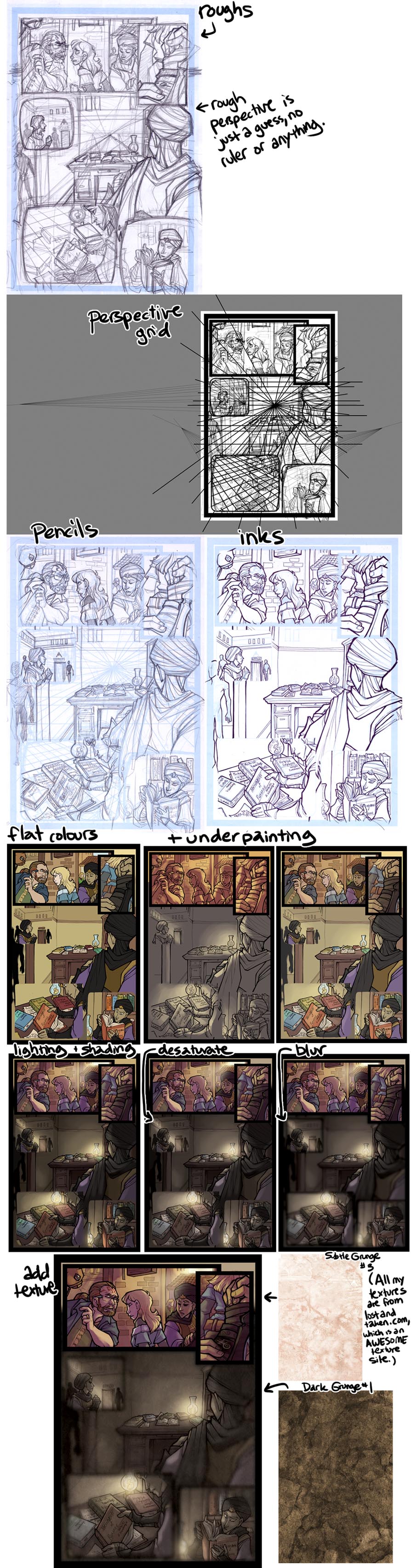
Vote Incentive for This Comic.
Gosh gosh gosh thank you so much!! I'm super happy with how it came out! *u*
And ahhhh I'm so glad the process shots gave you ideas!
For me, my underpainting is different colours depending on the lighting of the scene! :"D Some nighttime scenes have had shades of blue or purple, the scene of Sev landing at the beginning of the chapter had a mostly pink underpainting, whereas most of the scenes in dhemin have had yellow and orange to reflect the afternoon sun getting lower, and many of the Agorath Order scenes are weird colours like green or bright red to make the Order's lighting seem off.
Since I shade on top of the underpainting, I use the it primarily to set the colour of the lighting of the scene, to make all the colours fit together, rather than using that as the main source of rendering. :")
AND TEXTURES ARE SO GREAT. They feel like cheating!! I think you can't get carried away and abuse them but they make a great extra subtle touch, and for me it dilutes a little of the smoothness that digital colouring tends to have, which I like. :")
posted at 10:37pm on October 15th, 2013
HOw does it work exactly? I see that the underpainting and the shading are listed as two separate steps; could you tell me a little more about how you apply them differently? I'd sure appreciate the advice! ^^
posted at 10:14am on October 18th, 2013
The thing is that colouring is very difficult for me, and I'm also very slow at choosing colours, so I have a lot of tricks in my process that speed that up for me! IT SEEMS LIKE A LOT OF EXTRA STEPS but ultimately it gives me a better page faster because the process of doing it right in one step would take me a lot of time. (There are definitely better ways to approach colouring if you want to get good at it.)
The first thing I do is a layer of flat colours, that is just straight up WHAT COLOUR THAT THING IS. The sky is blue, apples are red, grass is green. As I've referenced before, I use a specific set of swatches to colour my characters, which is actually not a great way to go because things usually are different colours under different lighting.
My way around this is what I refer to as my underpainting -- just the basic colour of the light and the atmosphere that I put on a layer underneath my layer of flat colours. I make the flats just a little bit transparent (like 75% or so) so that the underpainting shows through, and it makes all the flat colours less garish -- they're now affected by the lighting of the scene.
This isn't a great way to get contrast, though, so I have a shading layer on TOP of that. I fill that layer with white and shade with a colour that seems to make sense (in real life, shadows tend to be blue or purple under yellow light, but different lighting will change that), and set the whole layer as a "multiply" layer (which in effect blends with the underlying colour but makes it a darker).
If you'd like to actually watch me doing this, I have recorded part of the process and explain what I'm doing about 5 minutes or so in, but my livestreams tend to be, um, long, so I don't know if that's a desirable method. xD
posted at 2:21pm on October 18th, 2013
Comment by riverfox237
Holy COW this PAGE and this VOTE INCENTIVE! The page is brilliant; I LOVE the visual effect you achieved, it really fits with what's going on, and I think it's quite brilliant. Dude, so Xira can reach into the dude's mind and access entire BOOKS he's read? That is SO HANDY. (Either that or it's Why?!?!'s, which also makes a lot of sense. In fact, now that I look at the titles on the books, that IS what's going on, isn't it? Which is even MORE handy because you don't have to delve through the dude's entire memory. XD)
I didn't catch at first that he was touching his own arm and not the guy's, but that's because I rush out of interest. Pretty great that he's able to do that without the guy necessarily noticing. Xira would make a pretty boss detective Iamjustsayin'.
And the vote incentive is brilliant, because I have often wondered what goes into these amazingly-detailed comics people like you do. So your underpainting is shades of yellow? I've usually done that with grays, I never thought of this! Hope you don't mind if I borrow that sheet as a color ref so I can try it! And I never realized people use texture pallets to give the whole page texture. BRILLIANT! I feel so inspired right now. =D Thanks for that breakdown, Shazzbaa!
posted at 5:21pm on October 14th, 2013